How I helped Perci engage users
How I helped Perci engage users
How I helped Perci engage users
Overview
Perci is a mobile app that aims to help people better prepare themselves, their families, and their personal property for natural disasters.
I collaborated with Perci to create a holistic messaging framework and developed copy and UI for a multi-faceted messaging plan aimed helping users understand their next task, and at driving users back to the app to complete tasks.
The Problem
The Problem
Perci had a valuable app that offered a ton of essential survival planning help for users, but it didn’t give them very much direction. As we see with many apps, new users were falling off after completing their first few tasks.
Perci had a valuable app that offered a ton of essential survival planning help for users, but it didn’t give them very much direction. As we see with many apps, new users were falling off after completing their first few tasks.
Perci had a valuable app that offered a ton of essential survival planning help for users, but it didn’t give them very much direction. Users were dropped into the app and left on their own to figure out what to do. As we see with many apps, new users were falling off after completing their first few tasks.
Usage data showed us that it was important to provide users with a more structured, guided experience. There would be additional, future UX enhancements to explore in this vein, but the first effort would be to improve messaging to the user.
Overview
Design
Evaluation
As a first time user myself, my very first step was to explore the app from a new user’s persepctive. This help me establish a general “state of the product.” While this wouldn't stand in as user research,
User Journeys
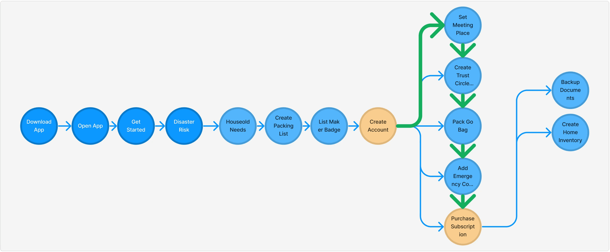
Next, I spent time reviewing - and refreshing - some existing user journey maps that the Perci team had created. This gave me a deeper understanding of existing gaps in the user experience and helped us identify key points of attrition. These would become some of the main points to message users.
The Problem
Design
Deliverables
Perci is a mobile app that aims to help people better prepare themselves, their families, and their personal property for natural disasters.
I collaborated with Perci to create a holistic messaging framework and developed copy and UI for a multi-faceted messaging plan aimed helping users understand their next task, and at driving users back to the app to complete tasks.
An existing, simplified user journey map
The updated user journey map, including key points to message users (green squares)
Evaluation
As a first time user myself, my very first step was to explore the app from a new user’s persepctive. This help me establish a general “state of the product.” While this wouldn't stand in as user research,
User Journeys
Next, I spent time reviewing - and refreshing - some existing user journey maps that the Perci team had created. This gave me a deeper understanding of existing gaps in the user experience and helped us identify key points of attrition. These would become some of the main points to message users.
From this point, I began work on two deliverables:
Message Copy & UI
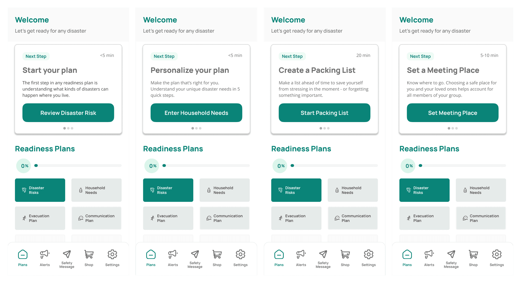
In Figma, I started exploring how the framework would be applied across multiple messaging channels, including in-app, mobile push notifications, and email.
Experimented with multiple potential messaging flows using the aforementioned user journey maps in FigJam. This allowed quick and close collaboration with the app founder to narrow down our initial approach.
Once we determined a suitable path, I began writing message copy and developing UI.
Deliverables
From this point, I began work on two deliverables:
The existing question player
needed a UI update to bring
it up to speed with the rest
of our products
The existing question player
needed a UI update to bring
it up to speed with the rest
of our products
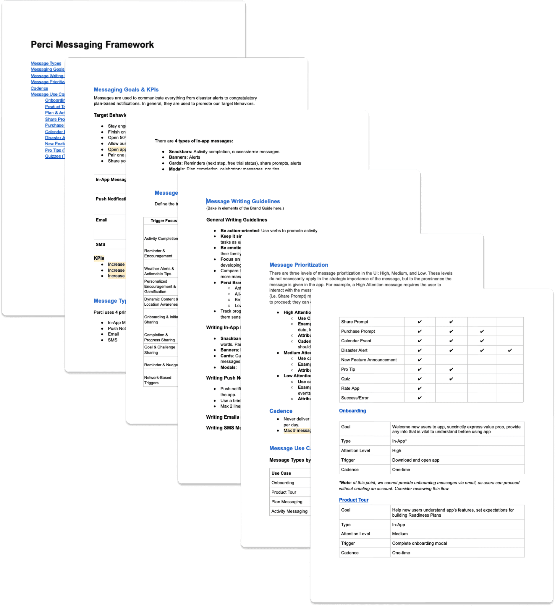
Messaging Framework
I began developing a comprehensive messaging framework. A few key elements include:
• Messaging Goals & KPIs
• Message Types: in-app, push, email, SMS
• Message Triggers: activity reminder, activity completion, etc.
• Message Prioritization: High Attention, Medium Attention, Low Attention
• Writing Guidelines
Message Copy & UI
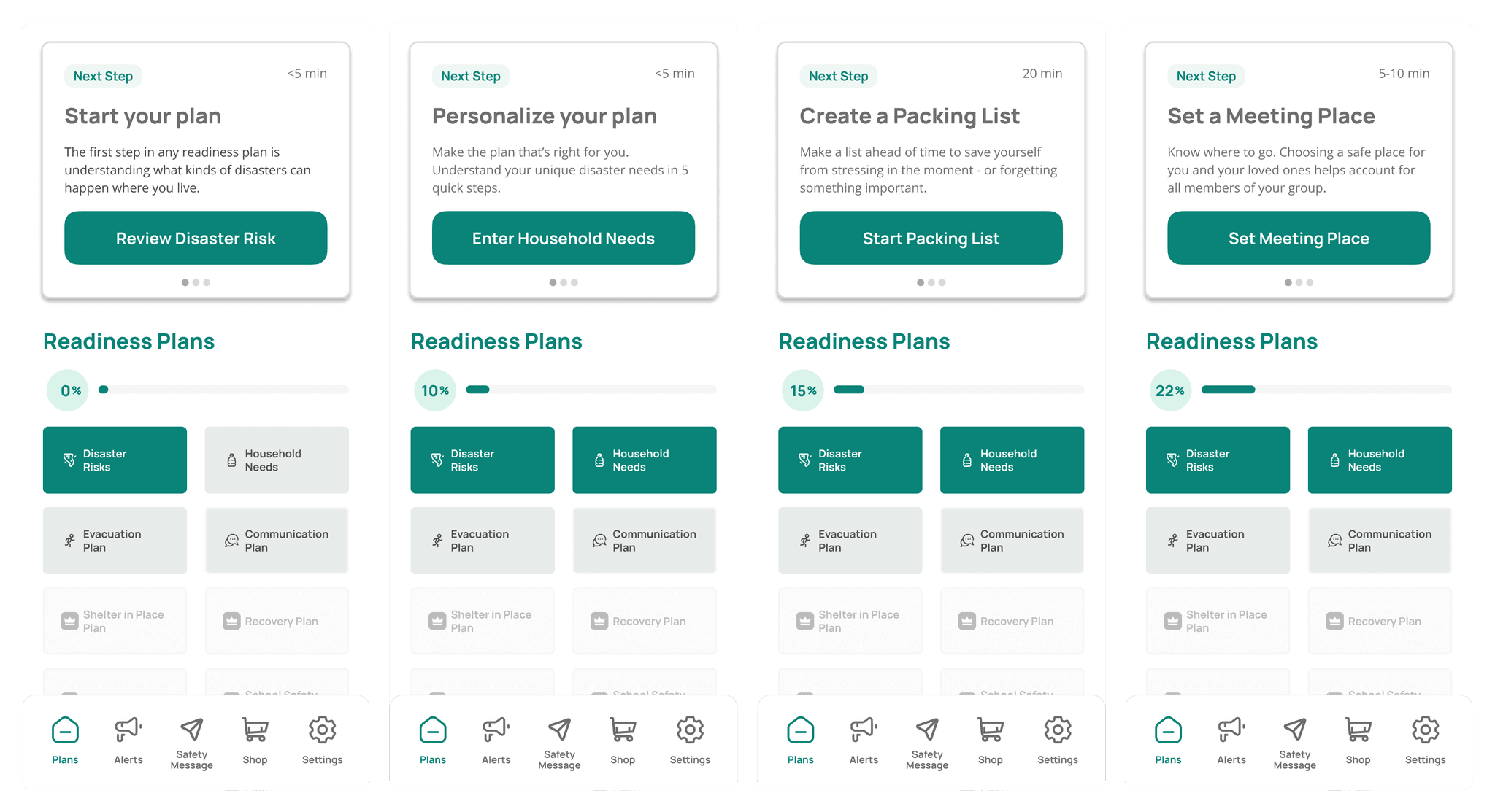
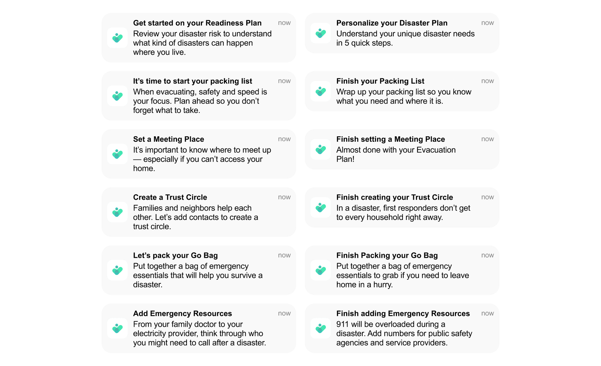
In Figma, I started exploring how the framework would be applied across multiple messaging channels, including in-app, mobile push notifications, and email.
Experimented with multiple potential messaging flows using the aforementioned user journey maps in FigJam. This allowed quick and close collaboration with the app founder to narrow down our initial approach.
Once we determined a suitable path, I began writing message copy and developing UI.
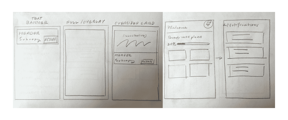
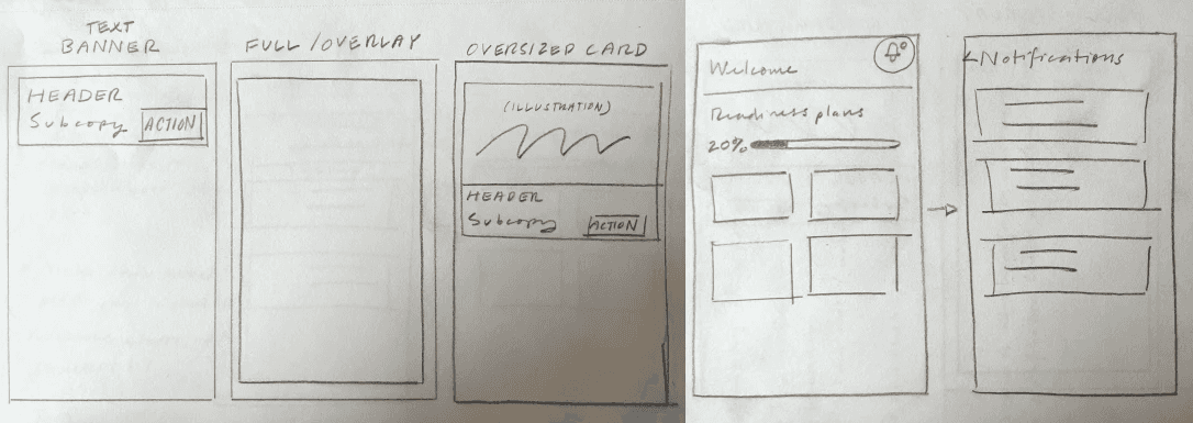
Initial sketches of potential in-app message approaches
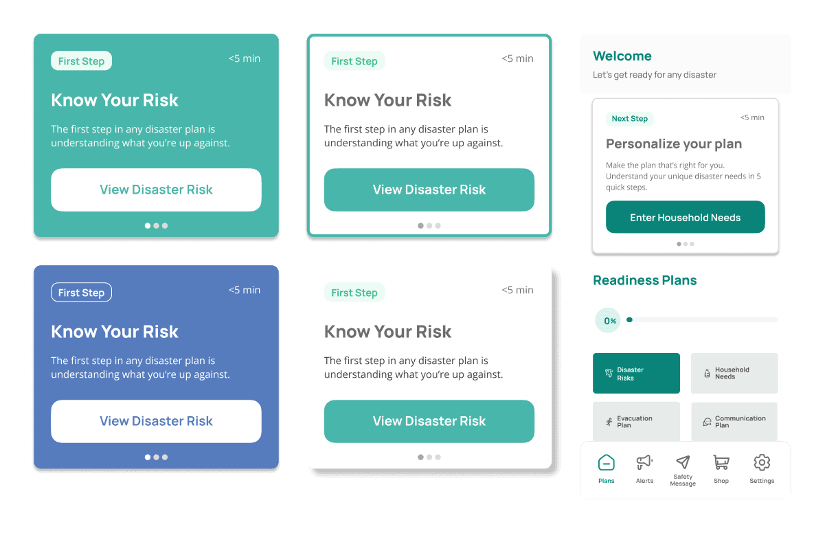
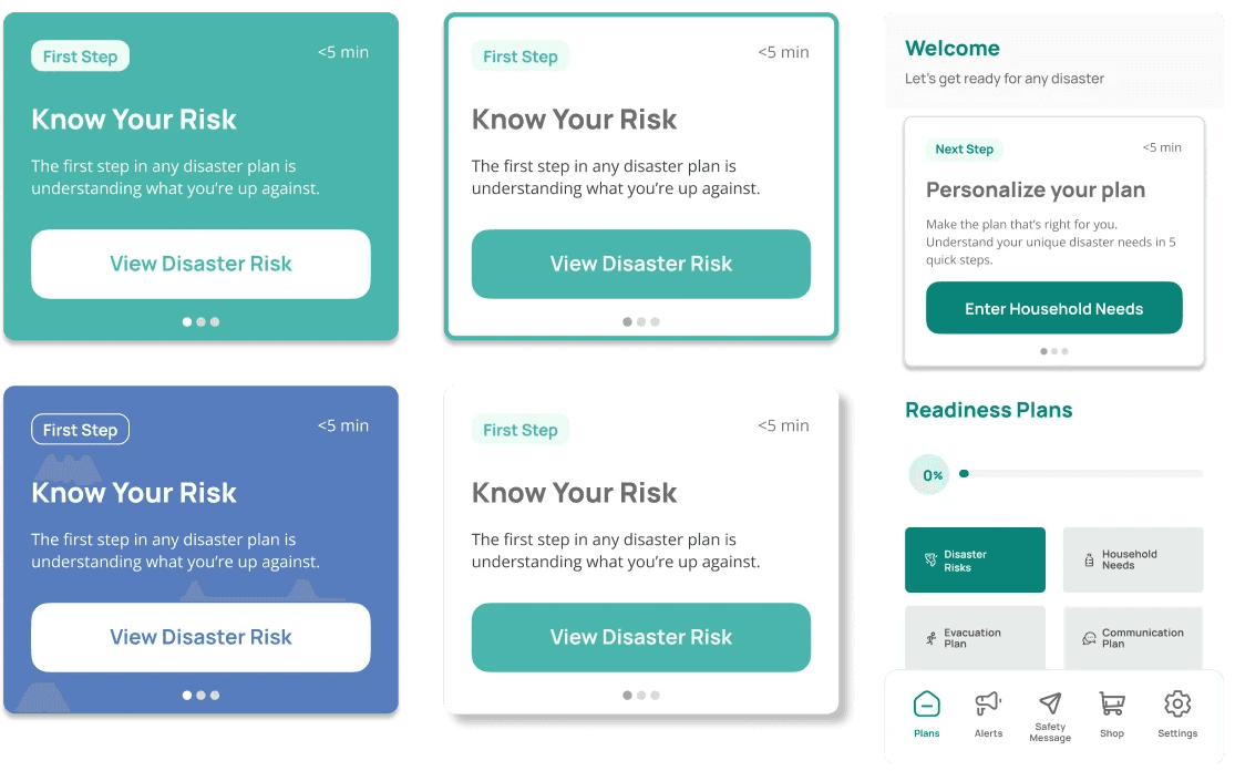
First UI drafts of in-app messages in Figma
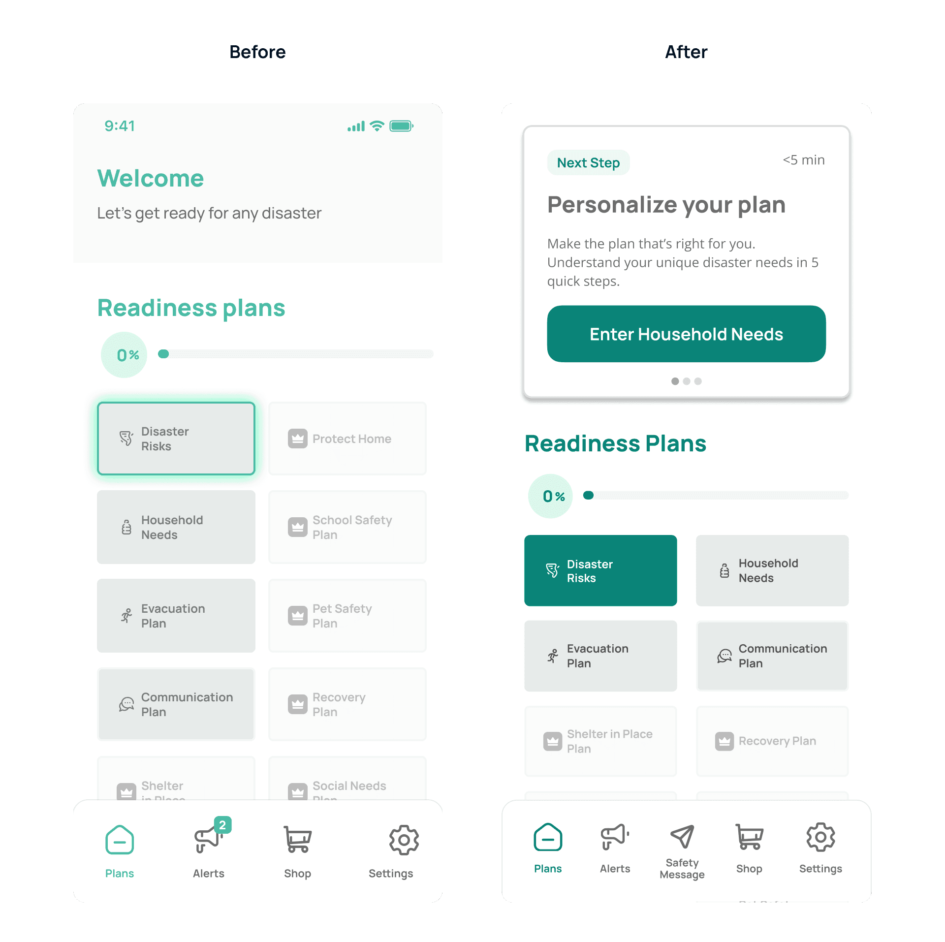
Final in-app messaging UI on the Perci Welcome page
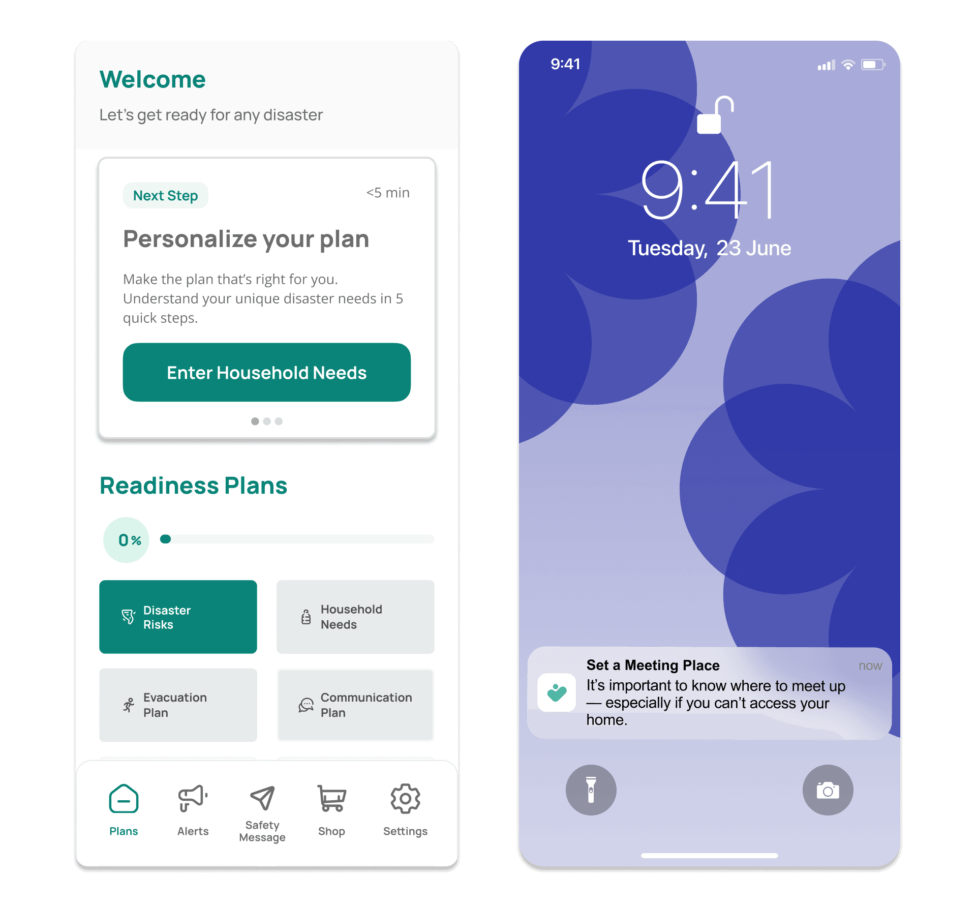
A sample of push notifications aimed at getting users to re-engage with the app and complete readiness plans

